配置文档
对于本站点的配置主要参考 技术笔记 进行设置, 根据个人需要进行灵活配置
请根据需要灵活选择, 我是基本按安装了我的所有扩展, 导致我的部署时间变长了, 所以请理性安装
plugin-image-zoom
单击图片放大插件�,效果:
- 安装命令
- 配置
npm install --save flexanalytics/plugin-image-zoom
 plugins: [
  'plugin-image-zoom',
],
plugin-ideal-image (图片懒加载)
- 作用 : 生成近乎理想的图像的 Docusaurus 插件(响应式、懒加载及低像素占位图)
如果你想要实现下面的各种扩展或者要写大文档, 建议安装此插件, 避免因为图片太多而导致页面加载时间变长, 关于安装请查看官网: plugin-ideal-image
修改首页方框内容
 修改上述图片中使用红框标识的部分, 前往
 src/pages/index.tsx 中进行修改
function HomepageHeader() {
  const {siteConfig} = useDocusaurusContext();
  return (
    <header className={clsx('hero hero--primary', styles.heroBanner)}>
      <div className="container">
        <Heading as="h1" className="hero__title">
          {siteConfig.title}
        </Heading>
        <p className="hero__subtitle">{siteConfig.tagline}</p>
        <div className={styles.buttons}>
          <Link
            className="button button--secondary button--lg"
            to="/docs/intro">
            Docusaurus Tutorial - 5min ⏱️
          </Link>
        </div>
      </div>
    </header>
  );
}
顶栏下拉框
有时候需要在顶部栏中添加下拉框进行示例, 所以需要对 docusaurus.config.ts 文件进行一些修改
const config: Config = {
  themeConfig: {
    label: 'Docs',
    position: 'left',
    items: [
      {
        label: 'Tutorial',
        to: 'docs/intro',
      },
      {
        label: 'API',
        to: 'docs/api',
      },
      {
        label: 'Guides',
        to: 'docs/guides',
      },
    ],
  }
}
修改 / 页面的图片
.heroBanner {
  padding: 4rem 0;
  text-align: center;
  position: relative;
  overflow: hidden;
  color: white;
    background-image:
        linear-gradient(rgba(0, 0, 0, 0.5), rgba(0, 0, 0, 0.5)),
        url(./img/test.png);
    background-size: cover;
}
Github 部署
部署项目
在本地创建好 Docusaurus 网站, 随后在 Github 创建对应的存储库
GitHub 会将命名为 .github.io 的仓库视为一个用户或组织的 GitHub Pages 站点。这意味着该仓库将被用于托管静态网站,并通过 GitHub Pages 服务自动部署到一个特定的域名。
所以如果你是第一个 GitHub Pages ��站点,此仓库名称为 username.github.io , 如果有多个请查看 多仓库部署
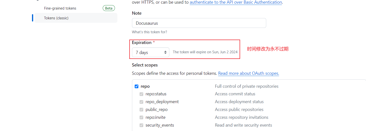
之后, 前往 Github 个人设置界面创建一个 TOKEN
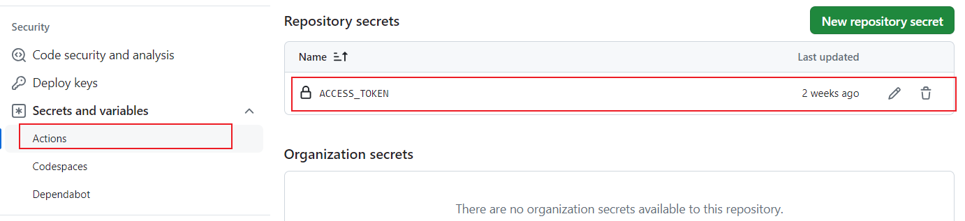
随后, 前往对应的仓库, 设置仓库的相关内容, 将刚刚获取到的 Token 设置到其中, 名字就不要变了,后面会用到的
将文件同步到 Github 仓库中, 并创建一个分支 gh-branch , 之后再创建一个新的文件
# Copyright 2022 zhaoguoxing
#
# Licensed under the Apache License, Version 2.0 (the "License");
# you may not use this file except in compliance with the License.
# You may obtain a copy of the License at
#
#     http://www.apache.org/licenses/LICENSE-2.0
#
# Unless required by applicable law or agreed to in writing, software
# distributed under the License is distributed on an "AS IS" BASIS,
# WITHOUT WARRANTIES OR CONDITIONS OF ANY KIND, either express or implied.
# See the License for the specific language governing permissions and
# limitations under the License.
name: Deploy Arden Github pages
on:
  push:
    branches:
      - main
jobs:
  build-and-deploy:
    runs-on: ubuntu-latest
    steps:
    - name: Checkout
      uses: actions/checkout@main
      with:
        persist-credentials: false
    - name: Install and Build
      run: |
        npm install
        npm run-script build
    - name: Deploy
      uses: JamesIves/github-pages-deploy-action@releases/v3
      with:
        ACCESS_TOKEN: ${{ secrets.ACCESS_TOKEN }}
        BRANCH: gh-branch
        FOLDER: build
        BUILD_SCRIPT: npm install && npm run build
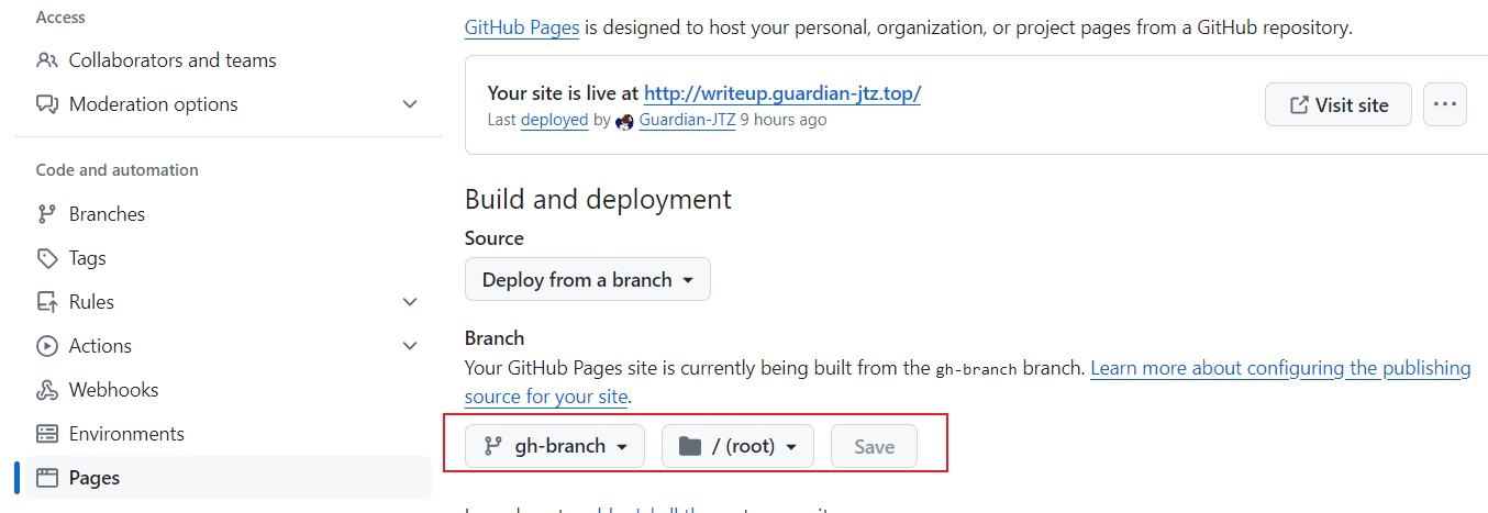
再进行一次同步操作, 随后再次前往设置操作界面进行再一次的配置, 随后你就会发现 Action 开始部署了, 如果你访问不到网站, 可以尝试重新运行 Github Action
多仓库部署
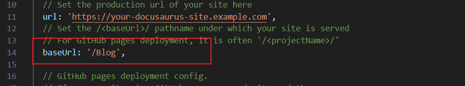
如果你有两个相同的网站想要部署在 Github 上, 你可以按照原本的的流程制作, 比如一个是 user.github.io 而另一个可以将存储库设置为 Blog 这样的名称,同时修改 Blog 存储库中的 docusaurus.config.ts
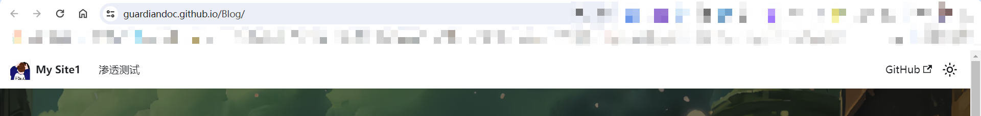
之后进行部署就可以了, 效果如下:
所以没必要买域名, 我傻逼还买了一个域名,真的是亏麻了
绑定自定义域名
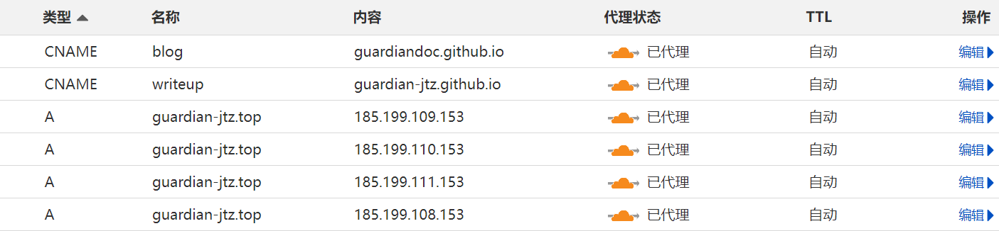
我是在阿里云买的 .top 域名, 10 年花费 188 元, 还是很值的但是需要定好自己的顶级域名不然很贵, 不需要买其他的服务, 也没有什么内容,之后使用 cloudflare 的 DNS, 具体教程可以看下面两个视频
如果你有两个要部署的网站, 但是不知道怎么部署, 你可以参考我的内容, 其实和正常部署一样
代码高亮
docusaurus 使用 prism 来对不同的语言进行语法高亮,这里 是默认支持的语言列表,如果需要启用更多语言的支持,可以在 docusaurus.config.js 中配置下 additionalLanguages(点 这里 查看 prism 支持的所有语言的列表):
prism: {
  // prism supported languages: https://prismjs.com/#supported-languages
  additionalLanguages: [
    'java',
    'json',
    'hcl',
    'docker',
    'bash',
    'diff',
    'scss',
    'lua',
    'makefile',
    'ignore',
  ],
  ...
}
建议是按需启用,可尽量减少站点依赖的 js 文件体积。
admonitions 扩展
原始的 admonitions 功能有限, 我想添加一个问题 admonitions, 就开始了搜索, 最终发现 Creating Custom Admonitions in Docusaurus React App
- 示例
- 配置文档
question 内容
podcast 内容
book 内容
npm install react-icons
presets: [
    [
      'classic',
      {
        docs: {
          sidebarPath: './sidebars.ts',
          admonitions: {
            keywords: ['question','podcast', 'newsletter', 'book'], // 在这里添加想要扩展的 admonitions
            extendDefaults: true,
          },
        },
      }
    ]
]
.admonition {
  margin-bottom: 1em;
}

.admonitionHeading {
  font: var(--ifm-heading-font-weight) var(--ifm-h5-font-size) / var(--ifm-heading-line-height) var(--ifm-heading-font-family);
  text-transform: uppercase;
  margin-bottom: 0.3rem;
}

.admonitionHeading code {
  text-transform: none;
}

.admonitionIcon {
  display: inline-block;
  vertical-align: middle;
  margin-right: 0.4em;
}

.admonitionIcon svg {
  display: inline-block;
  height: 1.6em;
  width: 1.6em;
  fill: var(--ifm-alert-foreground-color);
}

.admonitionContent> :last-child {
  margin-bottom: 0;
}

.question {
  border-left: 5px solid var(--ifm-color-info-dark);
  background-color: var(    --ifm-color-info-contrast-background);
}

.podcast {
  border-left: 5px solid yellow;
  background-color: rgb(250, 250, 234);
}

.newsletter {
  border-left: 5px solid gray;
  background-color: rgb(241, 239, 239);
}

.book {
  border-left: 5px solid paleturquoise;
  background-color: rgb(238, 247, 247);
}
import React from 'react';
import clsx from 'clsx';
import Translate from '@docusaurus/Translate';
import styles from './styles.module.css';
import { ThemeClassNames } from '@docusaurus/theme-common';
import { AiOutlineQuestionCircle } from 'react-icons/ai'
import { MdPodcasts } from 'react-icons/md'
import { BiNews } from 'react-icons/bi'
import { IoMdBusiness } from 'react-icons/io'
import { BiDonateHeart } from 'react-icons/bi'
import { BsBook } from 'react-icons/bs'
import { IoPersonOutline } from "react-icons/io5";

function NoteIcon() {
  return (
    <svg viewBox="0 0 14 16">
      <path
        fillRule="evenodd"
        d="M6.3 5.69a.942.942 0 0 1-.28-.7c0-.28.09-.52.28-.7.19-.18.42-.28.7-.28.28 0 .52.09.7.28.18.19.28.42.28.7 0 .28-.09.52-.28.7a1 1 0 0 1-.7.3c-.28 0-.52-.11-.7-.3zM8 7.99c-.02-.25-.11-.48-.31-.69-.2-.19-.42-.3-.69-.31H6c-.27.02-.48.13-.69.31-.2.2-.3.44-.31.69h1v3c.02.27.11.5.31.69.2.2.42.31.69.31h1c.27 0 .48-.11.69-.31.2-.19.3-.42.31-.69H8V7.98v.01zM7 2.3c-3.14 0-5.7 2.54-5.7 5.68 0 3.14 2.56 5.7 5.7 5.7s5.7-2.55 5.7-5.7c0-3.15-2.56-5.69-5.7-5.69v.01zM7 .98c3.86 0 7 3.14 7 7s-3.14 7-7 7-7-3.12-7-7 3.14-7 7-7z"
      />
    </svg>
  );
}

function TipIcon() {
  return (
    <svg viewBox="0 0 12 16">
      <path
        fillRule="evenodd"
        d="M6.5 0C3.48 0 1 2.19 1 5c0 .92.55 2.25 1 3 1.34 2.25 1.78 2.78 2 4v1h5v-1c.22-1.22.66-1.75 2-4 .45-.75 1-2.08 1-3 0-2.81-2.48-5-5.5-5zm3.64 7.48c-.25.44-.47.8-.67 1.11-.86 1.41-1.25 2.06-1.45 3.23-.02.05-.02.11-.02.17H5c0-.06 0-.13-.02-.17-.2-1.17-.59-1.83-1.45-3.23-.2-.31-.42-.67-.67-1.11C2.44 6.78 2 5.65 2 5c0-2.2 2.02-4 4.5-4 1.22 0 2.36.42 3.22 1.19C10.55 2.94 11 3.94 11 5c0 .66-.44 1.78-.86 2.48zM4 14h5c-.23 1.14-1.3 2-2.5 2s-2.27-.86-2.5-2z"
      />
    </svg>
  );
}

function DangerIcon() {
  return (
    <svg viewBox="0 0 12 16">
      <path
        fillRule="evenodd"
        d="M5.05.31c.81 2.17.41 3.38-.52 4.31C3.55 5.67 1.98 6.45.9 7.98c-1.45 2.05-1.7 6.53 3.53 7.7-2.2-1.16-2.67-4.52-.3-6.61-.61 2.03.53 3.33 1.94 2.86 1.39-.47 2.3.53 2.27 1.67-.02.78-.31 1.44-1.13 1.81 3.42-.59 4.78-3.42 4.78-5.56 0-2.84-2.53-3.22-1.25-5.61-1.52.13-2.03 1.13-1.89 2.75.09 1.08-1.02 1.8-1.86 1.33-.67-.41-.66-1.19-.06-1.78C8.18 5.31 8.68 2.45 5.05.32L5.03.3l.02.01z"
      />
    </svg>
  );
}

function InfoIcon() {
  return (
    <svg viewBox="0 0 14 16">
      <path
        fillRule="evenodd"
        d="M7 2.3c3.14 0 5.7 2.56 5.7 5.7s-2.56 5.7-5.7 5.7A5.71 5.71 0 0 1 1.3 8c0-3.14 2.56-5.7 5.7-5.7zM7 1C3.14 1 0 4.14 0 8s3.14 7 7 7 7-3.14 7-7-3.14-7-7-7zm1 3H6v5h2V4zm0 6H6v2h2v-2z"
      />
    </svg>
  );
}

function CautionIcon() {
  return (
    <svg viewBox="0 0 16 16">
      <path
        fillRule="evenodd"
        d="M8.893 1.5c-.183-.31-.52-.5-.887-.5s-.703.19-.886.5L.138 13.499a.98.98 0 0 0 0 1.001c.193.31.53.501.886.501h13.964c.367 0 .704-.19.877-.5a1.03 1.03 0 0 0 .01-1.002L8.893 1.5zm.133 11.497H6.987v-2.003h2.039v2.003zm0-3.004H6.987V5.987h2.039v4.006z"
      />
    </svg>
  );
}

function QuestionIcon() {
  return (
    <AiOutlineQuestionCircle
      title="Question Icon"
      style=""
    />
  )
}

function PodcastIcon() {
  return (
    <MdPodcasts
      title="Podcast Icon"
      style=""
    />
  )
}

function NewsletterIcon() {
  return (
    <BiNews
      title="Newsletter Icon"
      style=""
    />
  )
}

function CompanyIcon() {
  return (
    <IoMdBusiness
      title="Company Icon"
      style=""
    />
  )
}

function ContributeIcon() {
  return (
    <BiDonateHeart
      title="Contribute Icon"
      style=""
    />
  )
}

function BookIcon() {
  return (
    <BsBook
      title="Book Icon"
      style=""
    />
  )
}

function ExpertIcon() {
  return (
    <IoPersonOutline
      title="Expert Icon"
      style=""
    />
  )
}

// eslint-disable-next-line @typescript-eslint/consistent-indexed-object-style
const AdmonitionConfigs = {
  note: {
    infimaClassName: 'secondary',
    iconComponent: NoteIcon,
    label: (
      <Translate
        id="theme.admonition.note"
        description="The default label used for the Note admonition (:::note)">
        note
      </Translate>
    ),
  },
  tip: {
    infimaClassName: 'success',
    iconComponent: TipIcon,
    label: (
      <Translate
        id="theme.admonition.tip"
        description="The default label used for the Tip admonition (:::tip)">
        tip
      </Translate>
    ),
  },
  danger: {
    infimaClassName: 'danger',
    iconComponent: DangerIcon,
    label: (
      <Translate
        id="theme.admonition.danger"
        description="The default label used for the Danger admonition (:::danger)">
        danger
      </Translate>
    ),
  },
  info: {
    infimaClassName: 'info',
    iconComponent: InfoIcon,
    label: (
      <Translate
        id="theme.admonition.info"
        description="The default label used for the Info admonition (:::info)">
        info
      </Translate>
    ),
  },
  caution: {
    infimaClassName: 'warning',
    iconComponent: CautionIcon,
    label: (
      <Translate
        id="theme.admonition.caution"
        description="The default label used for the Caution admonition (:::caution)">
        caution
      </Translate>
    ),
  },
  question: {
    infimaClassName: 'question',
    iconComponent: QuestionIcon,
    label: (
      <Translate
        // id="theme.admonition.question"
        description='The default label used for the Question admonition (:::question)'
      >
        question
      </Translate>
    )
  },
  podcast: {
    infimaClassName: 'podcast',
    iconComponent: PodcastIcon,
    label: (
      <Translate
        description='The default label used for the Podcast admonition (:::podcast)'
      >
        podcast
      </Translate>
    )
  },
  newsletter: {
    infimaClassName: 'newsletter',
    iconComponent: NewsletterIcon,
    label: (
      <Translate
        description='The default label used for the Newsletter admonition (:::newsletter)'
      >
        newsletter
      </Translate>
    )
  },
  company: {
    infimaClassName: 'company',
    iconComponent: CompanyIcon,
    label: (
      <Translate
        description='The default label used for the Company admonition (:::company)'
      >
        company
      </Translate>
    )
  },
  contribute: {
    infimaClassName: 'contribute',
    iconComponent: ContributeIcon,
    label: (
      <Translate
        description='The default label used for the Contribute admonition (:::contribute)'
      >
        contribute
      </Translate>
    )
  },
  book: {
    infimaClassName: 'book',
    iconComponent: BookIcon,
    label: (
      <Translate
        // id="theme.admonition.book"
        description='The default label used for the Book admonition (:::book)'
      >
        book
      </Translate>
    )
  },
  expert: {
    infimaClassName: 'expert',
    iconComponent: ExpertIcon,
    label: (
      <Translate
        // id="theme.admonition.expert"
        description='The default label used for the Expert admonition (:::expert)'
      >
        expert
      </Translate>
    )
  }
};
// Legacy aliases, undocumented but kept for retro-compatibility
const aliases = {
  secondary: 'note',
  important: 'info',
  success: 'tip',
  warning: 'danger',
};
function getAdmonitionConfig(unsafeType) {
  const type = aliases[unsafeType] ?? unsafeType;
  const config = AdmonitionConfigs[type];
  if (config) {
    return config;
  }
  console.warn(
    `No admonition config found for admonition type "${type}". Using Info as fallback.`,
  );
  return AdmonitionConfigs.info;
}
// Workaround because it's difficult in MDX v1 to provide a MDX title as props
// See https://github.com/facebook/docusaurus/pull/7152#issuecomment-1145779682
function extractMDXAdmonitionTitle(children) {
  const items = React.Children.toArray(children);
  const mdxAdmonitionTitle = items.find(
    (item) =>
      React.isValidElement(item) &&
      item.props?.mdxType === 'mdxAdmonitionTitle',
  );
  const rest = <>{items.filter((item) => item !== mdxAdmonitionTitle)}</>;
  return {
    mdxAdmonitionTitle,
    rest,
  };
}
function processAdmonitionProps(props) {
  const { mdxAdmonitionTitle, rest } = extractMDXAdmonitionTitle(props.children);
  return {
    ...props,
    title: props.title ?? mdxAdmonitionTitle,
    children: rest,
  };
}
export default function Admonition(props) {
  const { children, type, title, icon: iconProp } = processAdmonitionProps(props);
  const typeConfig = getAdmonitionConfig(type);
  const titleLabel = title ?? typeConfig.label;
  const { iconComponent: IconComponent } = typeConfig;
  const icon = iconProp ?? <IconComponent />;

  const isQuestionAdmonition = type === 'question';
  const isNoteAdmonition = type === 'note';
  const isPodcastAdmonition = type === 'podcast';
  const isNewsletterAdmonition = type === 'newsletter';
  const isCompanyAdmonition = type === 'company';
  const isContributeAdmonition = type === 'contribute';
  const isBookAdmonition = type === 'book';
  const isExpertAdmonition = type === 'expert';

  const admonitionClassName = clsx(
    ThemeClassNames.common.admonition,
    ThemeClassNames.common.admonitionType(props.type),
    'alert',
    `alert--${typeConfig.infimaClassName}`,
    styles.admonition,
    {
      [styles.question]: isQuestionAdmonition,
      [styles.note]: isNoteAdmonition,
      [styles.podcast]: isPodcastAdmonition,
      [styles.newsletter]: isNewsletterAdmonition,
      [styles.company]: isCompanyAdmonition,
      [styles.contribute]: isContributeAdmonition,
      [styles.book]: isBookAdmonition,
      [styles.expert]: isExpertAdmonition,
    }
  );
  return (
    <div
      className={admonitionClassName}>
      <div className={styles.admonitionHeading}>
        <span className={styles.admonitionIcon}>{icon}</span>
        {titleLabel}
      </div>
      <div className={styles.admonitionContent}>{children}</div>
    </div>
  );
}
图标
可以直接从 Iconify 进行查看 如果想要实现 admonitions 扩展功能, 建议不要安装 Iconify 了, 这样过于臃肿了, 建议查看 react-icons
- 示例
- 配置
- 使用

npm install --save @iconify/react
// src/theme/MDXComponents.js
import React from 'react';
// Import the original mapper
import MDXComponents from '@theme-original/MDXComponents';
import { Icon } from '@iconify/react'; // Import the entire Iconify library.

export default {
  // Re-use the default mapping
  ...MDXComponents,
  IIcon: Icon, // Make the iconify Icon component available in MDX as <icon />.
};
// test.mdx
<IIcon icon="mdi:github" height="25" /> This is a GitHub icon.
卡片链接
- 示例
- 配置
- 使用

import React from 'react'
import styles from "./CardLink.module.css";
import clsx from "clsx";
import Link from "@docusaurus/Link";
import { AiOutlineArrowRight } from 'react-icons/ai';
import { useHistory } from 'react-router-dom';

interface CardProps {
    title: string;
    description: string;
    imageUrl: string;
    linkUrl: string;
}

const CardLink: React.FC<CardProps> = ({
    title,
    description,
    imageUrl,
    linkUrl,
}) => {

    const history = useHistory();

    const handleClick = () => {
        history.push(linkUrl);
    };

    const characterLimit = 65;
    let truncatedDescription = description;
    if (truncatedDescription.length > characterLimit) {
        // Find the last space within the character limit
        const lastSpaceIndex = truncatedDescription.lastIndexOf(' ', characterLimit);
        if (lastSpaceIndex !== -1) {
            truncatedDescription = truncatedDescription.substring(0, lastSpaceIndex) + '...';
        } else {
            truncatedDescription = truncatedDescription.substring(0, characterLimit) + '...';
        }
    }

    return (
        <div className={clsx("cardContainer", styles.cardContainer)} onClick={handleClick}>
            <img className={clsx("img", styles.cardImg)} src={imageUrl} alt={title} />
            <div className={clsx("divider", styles.divider)}></div>
            <div className={clsx("content", styles.content)}>
                <h2>{title}</h2>
                <p>{truncatedDescription}
                    <Link
                        to={linkUrl}
                        className={clsx(
                            styles.cardButton,
                        )}
                    > <AiOutlineArrowRight />
                    </Link>
                </p>

            </div>
        </div>
    )
}

export default CardLink
.cardContainer {
    display: flex;
    flex-direction: row;
    align-items: center;
    width: 100%; /* 占据整个页面宽度 */
    height: 8rem;
    border-radius: 10px;
    box-shadow: 4px 4px 4px rgba(0, 0, 0, 0.15);
    margin: 7px 0; /* 修改margin以调整布局 */
    transition: transform 0.3s ease;
}

.cardContainer:hover {
    cursor: pointer;
    transform: translateY(-5px);
}

.cardImg {
    flex: 0 0 15%; /* 固定15%的宽度 */
    height: 100%;
    object-fit: cover;
    border-radius: 10px 0 0 10px; /* 圆角调整 */
}

.content {
    flex: 1; /* 占据剩余的85%宽度 */
    padding: 4px 9%;
    display: flex;
    flex-direction: column;
    justify-content: center;
    height: 100%;
}

.cardButton {
    background-color: var(--ifm-color-secondary) !important;
    color: blue !important;
    font-size: 1rem;
    height: 25px;
    width: 33.33%;
    margin-left: 5px;
    display: inline-flex;
    align-items: center; /* 垂直居中 */
    justify-content: center; /* 水平居中 */
    max-width: 30px;
    border-radius: 50%;
}
.divider {
    flex: 0 0 1px; /* 固定1px的宽度 */
    height: 80%; /* 虚线的高度,可以根据需要调整 */
    border-left: 1px dashed #d3d3d3; /* 设置更细和颜色更淡的虚线 */
    margin: 0 1rem; /* 设置左右间距 */
}
import CardLink from '@site/src/components/CardLink/CardLink';

<CardLink
  title="卡片链接测试"
  description="卡片链接描述信息"
  imageUrl="https://pic.netbian.com/uploads/allimg/240527/001902-1716740342978d.jpg"
  linkUrl="https://baidu.com/"
/>
嵌入音乐/视频播放器
只需要安装 react-player 即可
npm install react-player
使用的时候引入依赖直接使用即可
import ReactPlayer from 'react-player'

# 视频链接
<ReactPlayer controls style={{ margin: '0 auto' }} url='video.mp4' />

# 音频链接
<ReactPlayer forceAudio style={{ margin: '0 auto' }} controls url='xxx.mp3' />
更多使用请看官方文档 react-player